
#aesthetic: On the Desire for Artsy Home Screens, School Notes, and Lives
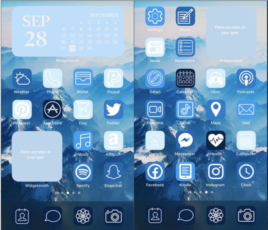
Photos courtesy of @viawishlist on Twitter.
With the arrival of the iOS14 iPhone update, many people used widgets or customized app logos to cultivate an aesthetic home screen.
Over the last few weeks, social media sites like Instagram and TikTok have flooded with photos of aesthetic home screens created with the new iOS 14 iPhone update. While some people grouped apps by color alongside new widgets, others created entirely new app logos. Still, others made each app look the same and removed all words to distinguish between apps.
With the arrival of iOS 14, the desire for these aesthetics suddenly became important to many people who saw these trends on social media. This parallels many occurrences throughout the last decade: following the invention of Pinterest and increasing popularity of social media, teenagers saw increased polaroid walls, collages, posed studying photos, heart-shaped foamy lattes, Instagram filters. The desire to cultivate a personal aesthetic—in bedrooms, social media, school—became synonymous with having one’s life together, even though it’s a superficial measurement. This begs the question: what are the benefits of aesthetics or color-coordination, not just on home screens, but in organization, such as school note-taking?
With the emergence of bullet journaling in 2013—a method of personal organization involving to-do lists and goals and popularized on social media with calligraphy and drawing, came the desire to transfer these aesthetics over to note-taking. But while bullet journaling stems more from an idea of organizing one’s life in a pretty or appealing way, or calming oneself through creating art, school notes require functionality.
Vanessa Yang (‘21), whose bullet journaling Instagram account (@vanessajournals) has accumulated nearly 60,000 followers, explained that she takes a much different approach to school notes. “I don’t really make my notes as ‘aesthetic’ as I try to make my journal.” she said. “I know that ultimately my notes and homework are meant for me to learn, not to look cute, so utility always comes first.”
Several Bishop’s students known for their organized notes noted similar philosophies to Vanessa, that they like organization and color-coding, but only to a certain extent. “I started making the notes pretty because I thought it would make paying attention more fun. But the problem was it took too long, so I’d always miss what the teacher said next,” Nadia Bitar (‘22) pointed out.
Several people explained that they found a middle ground where they could keep their notes organized and easy to read without taking the time to draw complementary pictures or add unnecessary headings. “I really like to color coordinate and separate my notes into different sections based on the topic,” explained Sara Hamadeh (‘22). She tends to use the organization in her notes for functional purposes rather than aesthetics. “My notes don’t look like the fancy notes you see online,” Eliana Birnbaum-Nahl (‘23) agreed, “because it’s pretty much colored headings and highlighted words, but it doesn’t take a lot of effort and is pretty helpful.”
Several interviewees talked about the way organizing sections by color helped with organization. But is there any science correlating color and organization or productivity? What other benefits may they have? According to a study performed by Dr. Kate Lee at the University of Melbourne, the color green, which has a low wavelength and an association with nature, correlates with improved concentration and creativity. According to a different study and ancient Chinese Feng Shui color-organizing techniques, warmer colors, especially orange, since it combines the effects of red and yellow, tend to remind people of sunsets and connote light and activity. This can correlate with increased focus and improved mood. Finally, blue, the most popular favorite color, tends to correlate with productivity, “especially in highly intellectual work which requires a high cognitive load,” one color psychology article noted, “for instance, programmers or academics.” While some of these studies conflict about specific colors signify concentration and which represent creativity, most agree that combinations of colors and overall color-coordination aid in balance and organization.
This data suggests that different colors can improve mental health and intellectual ability. Just as separating notes into sections by color can improve organization and mood, keeping one’s iOS 14 iPhone home screen organized may make them happier and keep them calm and motivated.

Clare Malhotra was born in Boston, Massachusetts and moved to La Jolla at age nine. She is currently a senior, and this is her third year on The Tower....